In our last blog post we shared statistics about the power of email marketing. This week we are sharing best design practices for creating quality email campaigns. Keep these in mind as you learn more and work to enhance your email design skills.
Stay on-brand
Your email design should have the same look and feel as the rest of your marketing materials, including your website and social media platforms. Use email marketing as a means of strengthening your brand, not an opportunity to stray from it. Your design should be consistent with your brand identity in the following ways at-minimum: color pallet, font, tone and message.
Be mobile-responsive
A majority of people check their email on their smart devices — often before they even get out of bed. Your email design must be mobile-responsive so that your message looks just as good, and functions just as well, on a small screen as it does on a laptop or desktop computer.
Use an email template
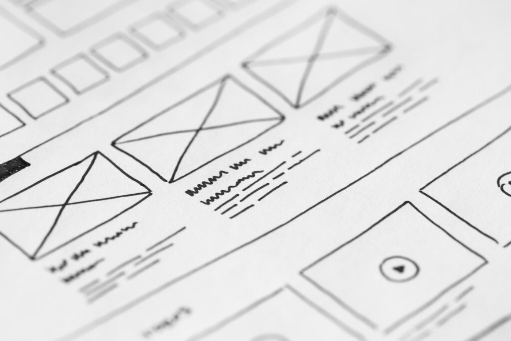
Often, you can use email templates to make the email design process easier. Make sure to incorporate a good amount of white space around each design piece and use colors for contrast. Avoid too many light grays or off-whites, both as font color and as a background choice. It’s too easy to have a gray-heavy design look washed out.
Once you have a solid grasp of the basics of email design, you’ll be ready to integrate email marketing into your comprehensive online marketing plan.
(Source: Constant Contact)
Need help with your email marketing? The Advantage Marketing team is expert at developing targeted email campaigns. Schedule a quick call with Loraine to learn more.


